Pages#hzroot4951767 div {width:100%;}#hzfooter4951767 {line-height:normal;}

Follow me on facebook and twitter

Welcome

Welcome to my blog. I hope to share information and ideas that you will find informative, valuable and entertaining. If you would like information on something specific ( or you just have a question) be sure to e-mail me at (wallstoo@comcast.net), you can also visit my website at www.wallstoowindows.com Otherwise, sit back and enjoy!!!!

Wednesday, November 10, 2010

Use of glass in kitchen cabinets

These pictures are courtesy of Kitchen and Bath design, and they show some wonderful uses to perk up  cabinets.  The first one shows the use of a visually appealing curved glass cabinet that adds a completely different element than just the standard sharp corner cabinet.
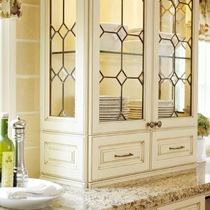
Here the use of beveled glass and lighting  adds architectural detail and and really kicks it up a notch. 

Don't really want to see totally through the glass doors, but just a hint of what's behind?, add semi opaque glass for some obscurity.


Have a peninsula? Want to retain a view? Want to make the kitchen seem bigger and airy? Don't want to loose cabinet space.?  Try having both sides of the cabinets in glass, this is a great way to use natural light and have access to both sides of the cabinet.  Instant beauty.


Here's another view of the use of clear glass see through cabinets. Notice how light this feels, another use to maximize the natural light.


Want to break up a wall of wood? Then using glass door fronts may just be the answer.  Another option here would be to have solid wood fronts on the lower half and reserve the uppers for glass fronts, add ambient lighting and you have a dramatic look to your space.


Storage and beauty, imagine the difference if this was all in solid wood. Here the use of glass fronts creates a beautiful buffet.


Here the use of ribbed glass doors can lend a bit of a contemporary clean look.
Find the texture of glass that suits your style.


This kitchen really needed to break up the whole white wall look.  By using glass fronts, this adds visual interest to the whole project


This two tone kitchen with beverage center in black with leaded glass, gives the look of a furniture piece, creating a high end look.


Monday, October 11, 2010

$50.00 off In Home Design/Color Consultation

Be sure to take advantage of the $50.00 off  "In Home Design Consultation".  Get your home ready for those Holiday guests and events.  Expires 12/31/10

Monday, September 13, 2010

$1500 tax credit - use it in 2010

Dont' forget the $1500 tax credit ends this year.  The Hunter Douglas Duette Architella product qualifies for this energy credit with significant energy savings.  I recently installed these for a client with windows that were East and West facing (let's talk heat all day long)  in addition they were on the second story vault and unreachable.  We installed Hunter Douglas Duette Architella's with PowerRise 2.0 platinum technology (radio frequency), operated from an easy to reach wall switch (no hard wiring). This is what she had to say:

"We are so thrilled with our new Hunter Douglas window coverings, the best  news of all is our August utility bill was HALF of what is was last August. In addition, our AC doesn't kick on until late in the afternoon.  I would credit the difference due to the high energy efficiency of our lovely new Architella window coverings.  They are already paying for themselves".
K. Olson
wireless wall switch on left
Duette Architella


Check out the following Fall promotions starting Sept 25th.
Call to schedule your free window covering consultation.  360-687-5076

Monday, July 26, 2010

Arrgghh, Why is it so hard to do your own space?

OK, so I thought I would share a bit of insight into this whole design process stuff and give you a personal glimpse into what  goes on even in the head of a professional, when faced with personal design decisions.  Here goes, don't judge me too harshly.  I am finally getting granite counters in my kitchen.  After years of selecting them for clients, the time has come for me to enjoy the beauty and ambiance that only granite can provide. (This might have happened earlier, but college tuition seemed to take precedence). So with that decision made, it should have been a quick jump to selecting the product, Right?  WRONG!!!  First I had to select a new sink, (under mount of course).  This actually wasn't so hard.  After research, I decided on a composite black granite double bowl by Elkay (one of the leaders in granite sinks).  The faucet also by Elkay has a real commercial grade look to it.  So far so good!  Now on to the granite choice.  What muddied the waters a bit here is that I needed to save the existing backsplash.  I actually like my current backsplash (it has a timelessness to it), but that really made an impact on deciding what granite slab would go with it.  So off I trotted to collect samples from the tile and granite suppliers.
Many of them looked great in the store, but when I brought them home the lighting in my home gave them a whole different look. Are you all listening?
Lighting plays a HUGE factor in every selection.  Finally selected a granite piece from a 12 inch square, with a name that I can't remember.  Step 2, go to the slab supplier to pick out the actual slabs that I would use.  Now if you have never had the opportunity to do this, it is an amazing experience.  But there is a 95% chance that the small sample you have will look NOTHING and I repeat NOTHING like the actual slab.   Now I wasn't silly enough to think this was going to be a quick process without emotional turmoil so I did bring along a friend with me.  It's important to note a couple of things here, my friend Amy is also a professional designer ( we have over 30 years combined experience) so clearly I was in good hands should emotion take over where good sense should prevail.  Did I also mention that Amy and I have the exact opposite in tastes!
So armed with backsplash samples in hand, and designer friend in tow off we went. As expected, my original choice looked  absolutely awful in a huge slab. So the selection process started over from scratch.  Wandering the vast array of slabs can be a daunting task, but my eye finally caught a slab that had everything  I needed (and everything my backsplash needed also).  Should have been simple from here right?  Wrong again.  The slabs came in polished and matte finish.  Oh what to do!  By now my decision making skills were sorely lacking (after all I am emotionally involved in this decision) and I really liked them both.  Here's is where professional assistance is most valuable.  After all, I had already asked everyone else down there, and it seemed to be a 50/50 split.
Amy was able to bring some clarity to the situation by asking me questions about the overall look that I wanted and present and future color options.
As we were pondering my choices, another lady walked by with that "deer in the headlights" look.  We explained that we were designers and offered to shed some light on her dilemma.  OK, creative juices started flowing, within minutes I was able to help her select the perfect slab (one that went with her current backsplash) in addition we were even able to select the perfect paint color options that would pick up on the  subtle colors in the slab.
So really what's the point of this story,  a couple of things, number one, it's always harder to do your own space because we are all  influenced by our emotions and our objectivity becomes muddled.  Number two, there are a ton of nice choices out there and you can't have them all.  You need to develop an initial game plan and stick with it.  Design assistance is invaluable when it comes to these two points.  I am so grateful that  I had someone to keep me on track and remind me of all the points that I share with my clients.
By the way, I decided on the polished slab and it will be installed this week.  I can hardly wait.

Thursday, June 3, 2010

Kitchen transformations and updating idea's

As the weather starts to turn warmer (hopefully) and we get the itch to update or change a few things, no other room in the house will give you the most "bang for your buck" as a kitchen update. Whether you are looking for a total remodel or just something along the lines of a "face lift" or freshening up, there are numerous possibilities. So with that in mind, I thought I would start a short series on ideas that can inspire you along the way. There are numerous aspects to kitchen updates but no other element has the transforming power of cabinetry. With the economy still in a fragile situation, I am asked many times just what can be done to existing cabinets to give them a fresh look. One good option, if the cabinets are in good shape, (maybe just outdated) is a good coat of paint. The transformation is amazing. Don't think you are stuck with a dated look of oak, with the right color combinations your kitchen will have a totally fresh new look. The picture at the top shows a "Butter Yellow" paint, softened with a glaze over the top. Yellow cabinetry can give even the darkest kitchen a sunnier disposition and it comes in a surprising variety of shades, from pale buttermilk, zesty lemon or gold. I have personally updated a clients oak kitchen cabinets with this theme and the outcome was outstanding.

This year's colors trends lean a bit toward the neutrals, and pewter is considered one of the neutrals. Black cabinetry has long been of favorite of mine, but if you want something a bit softer you can get fabulous effects with the subtle sheen of pewter. This neutral can act as a bridge between vintage and modern. Coupled with stainless steel appliances this can be a real eye popper.

If you're a bid timid about going too far with colored cabinetry, then think about concentrating it where it will have the most impact. That could be an island, or an amoire-style pantry or anything that you would like to create as a focal point. By repeating the accent color in other parts of the room, you will gain continuity and the magic of a room that flows well.


Not just "color" but the "finish" applied acts as major impact on the final look. Here, a glossy lacquer finish maximizes the reflectivity and intensity of the soft green color. This lends itself to a more modern contemporary look, whereas the same color used with a matte finish would have muted the green and lended itself to a more traditional
ambiance.

How about a "mix and match"? Try mixing your white cabinetry with a vibrant statement. Mixing colors let's you enjoy the best of both worlds and ensures a visually interesting result.


The two photo's above show the wide versatility of color choices,the photo on the right is done in a soft gray blue with a high gloss finish that gives an edgier look than the previously all white cabinetry. By using the high gloss finish, the look lends itself to a more contemporary feeling. The picture on the left gathered it's inspiration from the china plate on display, creating a warm and friendly ambiance. Whatever your inspiration or ideas are, a fabulous and economical kitchen renovation might just start with the cabinetry. For more ideas and a personalized consultation, I would be happy to schedule an appointment with you. Please call me at 360-687-5076/Walls too Windows, Interior Design.
Stayed tuned for the next in the series of Kitchen renovations, " The use of glass and lighting"

Wednesday, April 21, 2010

New and Improved Power Rise 2.0 with Platinum Technology from Hunter Douglas Debuts May 5Th 2010.

Gadgets that we previously saw only in a James Bond movie are now part of our daily lives. Lighting, heating, cooling, security, appliances and yes, window fashions can be automated and controlled remotely. With the Hunter Douglas Platinum Technology, you can raise and lower your window fashions using a wireless remote control. The benefits of the new system are:

1. Accommodates up to 57% larger shade sizes
2. Quieter motor- 3 decibels lower
3. Fabric covered valances with over 120 color choices
4. Common head rail/enclosed top
5. Smoother operation/no sticking or drifting
6. Easily accessible battery pack/uses AA batteries
7. Longer battery life
8. Increased operation speed/10% faster
9. Better aesthetics for receiver eye
10. Tighter fabric stack

I saw these at the Hunter Douglas presentation and was totally impressed with the quietness and ease of use. I have one ordered for a large window in my own home and am looking forward to the battery operated remote control wall switch operation. Duette Architella shadings provide three insulating air pockets that deliver superior energy efficiency in every climate and every season and can reduce energy loss up to 50%.
Have windows that you can't reach, then Platinum Technology is the answer for you. Call me to schedule an appointment to see all the options available.
360-687-5076


Product Features and Options
Hard Wired
Motorized Hunter Douglas window coverings are designed for guaranteed operation and precise control. Window coverings can be controlled via the elegant, contemporary-styled Platinum™ wall-switch with optional Platinum remote or through any home automation system.
The Platinum wall-switch fits standard Decora™ switch plates to blend with a room's décor. Two intermediate stop positions can be set at the wall-switch to meet your needs for privacy, while still allowing natural light into a room. Plus, integrating shade control into a home automation system has never been easier.
In conjunction with a Platinum wall-switch, shades can also be controlled from a Platinum remote control. This is the same remote that is used with Hunter Douglas PowerRise®, PowerGlide®, and PowerTilt™ products. Using the Platinum remote, window coverings can be controlled individually or in groups.
Hunter Douglas motorized window fashions can also be seamlessly integrated with any home automation system. Fashion and function are no longer exclusive concepts with Hunter Douglas motorized products.

Available with:
Alustra® Duette® honeycomb shades
Alustra® Silhouette® window shadings
Alustra® Vignette® Modern Roman Shades
Duette® Architella® honeycomb shades
Duette® honeycomb shades
Luminette® Modern Draperies
Luminette® Privacy Sheers
Silhouette® window shadings
Vignette® Modern Roman Shades

Monday, April 5, 2010

EA Accents » Blog Archive » French Laundry Style in Your Home - Everything you need to know NOW! about Eastern Accents

I love this line of bedding, there seems to be something for everyone. Get inspired with their new collections. Just click on the link below and enjoy the beauty. Questions? Just call 360-687-5076

Eastern Accents.

EA Accents » Blog Archive » French Laundry Style in Your Home - Everything you need to know NOW! about Eastern Accents

Monday, March 8, 2010


Here Patti Marvitz of Walls too Windows, helps some homeowners take advantage of the "1st Saturday Ask a Designer" series at Miller Paint. If you missed this opportunity, join us April 3rd from 11 am - 2pm.
Call 360-687-5076 for more information.

Sunday, February 14, 2010

REDUCE/REUSE/RECYCLE/RENEW

About two years ago, I passed the intense requirements needed to become a LEED - AP (Leadership in Energy and Environmental Design- Accredited Professional). This introduced me to "Sustainable Design and Green Building"
initiatives. It used to be we thought of the 3 "R's" as reading/writing/arithmetic.
Today's acronyms in reference to sustainability are REDUCE/REUSE/RECYCLE/RENEW. So when I see a company maximizing eco-savvy elements, I can clearly feel comfortable sharing that with my clients to help them make informed purchases. Here is information from the Hunter Douglas shutter collection in regards to the four key categories of earth friendly sustainability.

REDUCE--

*Reduce emissions-all shutter collection products are "GREENGUARD" indoor Air Quality Certified and GREENGUARD Certified for Children and Schools
*Reduce the use of artificial light-all shutters products offer white louvers that can be used to redirect and reflect natural light to the ceiling, bringing the light deeper into a room.
*Reduce energy costs- all shutter products offer exceptional R-value performance to maximize home heating and cooling use throughout the year
*Reduce damage to furniture and flooring-all shutter products block up to 99% of the damaging UV rays when closed.
*Reduce the need for replacement-shutters traditionally offer the longest window covering life span due to their timeless design, low maintenance and enduring composition.

REUSE

*95% of excess Newstyle cap material from the manufacturing process, is shredded, ground and reused as polypropylene sheeting material in the US.
*Each month the Custom Shutter Division collects over 250,000 pounds of sawdust which is reused by a paper mill in California to create paper-based products.
*Shutters are often reused as room dividers, headboards, table bases and other decorative ideas.

RECYCLE
*100% of Palm Beach polysatin shutters can be recycled when disassembled-polysatin components, aluminum reinforcements and metal hardware
*Hunter Douglas's recommended shutter packaging materials are made from recycled content and can be reused or recycled.
*Foam--50% recycled content and reusable
*Cardboard--20% recycled content and recyclable
*92% of manufacturing cardboard and paper are recycled annually
*The custom shutter division diverts 3.3 MILLION pounds of waste from landfills each year through recycling efforts.

RENEW
*Heritance hardwood shutters are made from a 100% renewable resource
*The Hunter Douglas Custom Shutter and Horizontal Blind Division's 2009 contributions to the Arbor Day Foundation equated to 11,125 trees being planted and approximately 2.8 million square feet of rain forest being preserved.
*Hunter Douglas is the only window fashions manufacturer partnering with the Arbor Day Foundation.
Buying quality shutters is a sustainable investment in your home, it is comforting to know that a purchase from the Hunter Douglas Shutter Division is also a sustainable investment in our environment.

Customer satisfaction equals quality and TEAMWORK!

I often speak of the value of teamwork for the successful design process and nowhere has this been more evident than in this last week. The above pictures show the process of installing Hunter Douglas custom wood plantation shutters. Although there were only two windows, one required providing privacy and view retention, drilling into travertine and covering a large expanse of window space. The other application was a pass thru that needed to look great from both sides. In addition the finished product needed to color coordinate with the cabinetry in the rest of the 5000 sq ft home. We choose the "Heritance" wood shutters by Hunter Douglas and achieved a custom color match that was just perfect. During installation, the client stated he did not want the magnet piece (that holds the louver doors closed) to be seen, so it was decided to recess it into the light gap strip. Enter Jeff Bjorge of "Jeff Bjorge Contracting", the general contractor on the job. Within minutes he had (with the precision of a surgeon), chiseled the exact size to recess the magnet, seconds later he had disassembled the magnet and re drilled the hole to accommodate a screw for attachment. On the second window application, Lee Harshberger (Hunter Douglas) and Bart Reynolds (Reynolds Installation) are extremely intent on perfect centering and alignment of the shutters over the soaking tub. In addition, this application required an additional support that had to be implemented on site (again by Jeff Bjorge). All the hard work and efforts by the team (client-designer-supplier-installer-contractor) provided the exact product and application the homeowner required.


Monday, January 18, 2010

The incredible power of COLOR
2010 forecasts
Color is one of the first things we notice when entering a room. It can set a mood, provide comfort or give voice to our personalities. The right color brings out the beauty of furnishings and enhances a room's decor. In fact, the impact of color is so important to every aspect of our lives, there is an international organization called the Color Marketing Group (CMG) that follows and reports on color trends and developments in all industries from home, fashion or automotive. Many companies rely on their forecasts to make the right color selections to be in alignment with trends that haven't even hit the market yet.
For 2010, the trends are defined as a combination of classic and contemporary. Cool and warm, quiet and vibrant, stable and unpredictable.
"Gray is THE neutral" meant to partner with every other imaginable color. The number one color combination for 2010, a gamut of blues (including both blue-greens and purple hues) balanced with warm yellows, oranges and pinks."
Other important trends include
*Layering and texture
*New city brights, for a ZING of color
*Metallics are still popular
* Less matchy colors and more unexpected pairings
Today's top colors, as presented by the 2010 Color Marketing Group
*PURPLE-grayed out violet: Redder plums: bluer-influenced fuchsias
*Blue is the new green-a whole range of blues including soft watery blues and vibrant sky blues'
*Grays and cooled down browns (taupe)
*Yellow for energy-bright vivid yellow is the stand out accent color.
*Bright accents from India, China and Turkey-yield oranges, turquoises and teals, red and yellow abound.
*White is now a business color - in matte vs. gloss: shine vs. shimmer
*What's old is new again, Mauve is back, but in new dusty violet shades, works as an accent but also as a neutral punched up by bright Asian accents.
If all this sounds a bit overwhelming, remember that trends come and go. It is more important to find out what color combination brings YOU comfort and speaks to YOUR soul.
For additional help on your colors selections, be sure to join me at Miller Paint for "First Saturday-ASK A DESIGNER" February 6th, 2010 from 11 a.m - 2 p.m. (111 NE 164th AVE. Vancouver WA 98684)
Questions? 360-687-5076
360-823-0030

Monday, January 11, 2010

Need some Design Assistance? Join me for 1st Saturdays-"ASK A DESIGNER". Feb 6th 11 am- 2 pm. Here is the opportunity you've been waiting for, bring in your fabric swatches, tile samples, throw pillows or the family pet and I will assist you with selecting the perfect color palette for your room. Have questions about lighting, space planning or whatever, just bring those too. Hope to see you there, (Miller Paint 111 NE 164Th Ave. Vancouver, WA) 360-687-5076 /360-823-0030